Cuisine Clinic

Custom packaging & Dieline | [ Oct 2025 ]

Built to turn the morning-after haze into a premium, clinical fresh start.

RoleGraphic Designer
ToolsAdobe Illustrator & Photoshop
FocusBranding & Identity

[ Objective ]

Cuisine Clinic packaging concept 1
Melon Missile
Cuisine Clinic packaging concept 2
Atomic Apple
Cuisine Clinic packaging concept 3
Blueberry Bomb

1 / 3

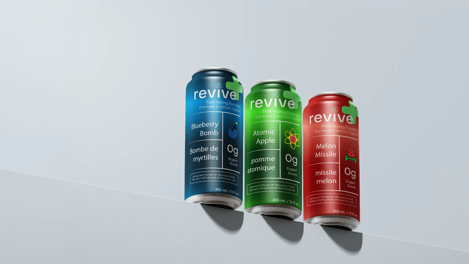
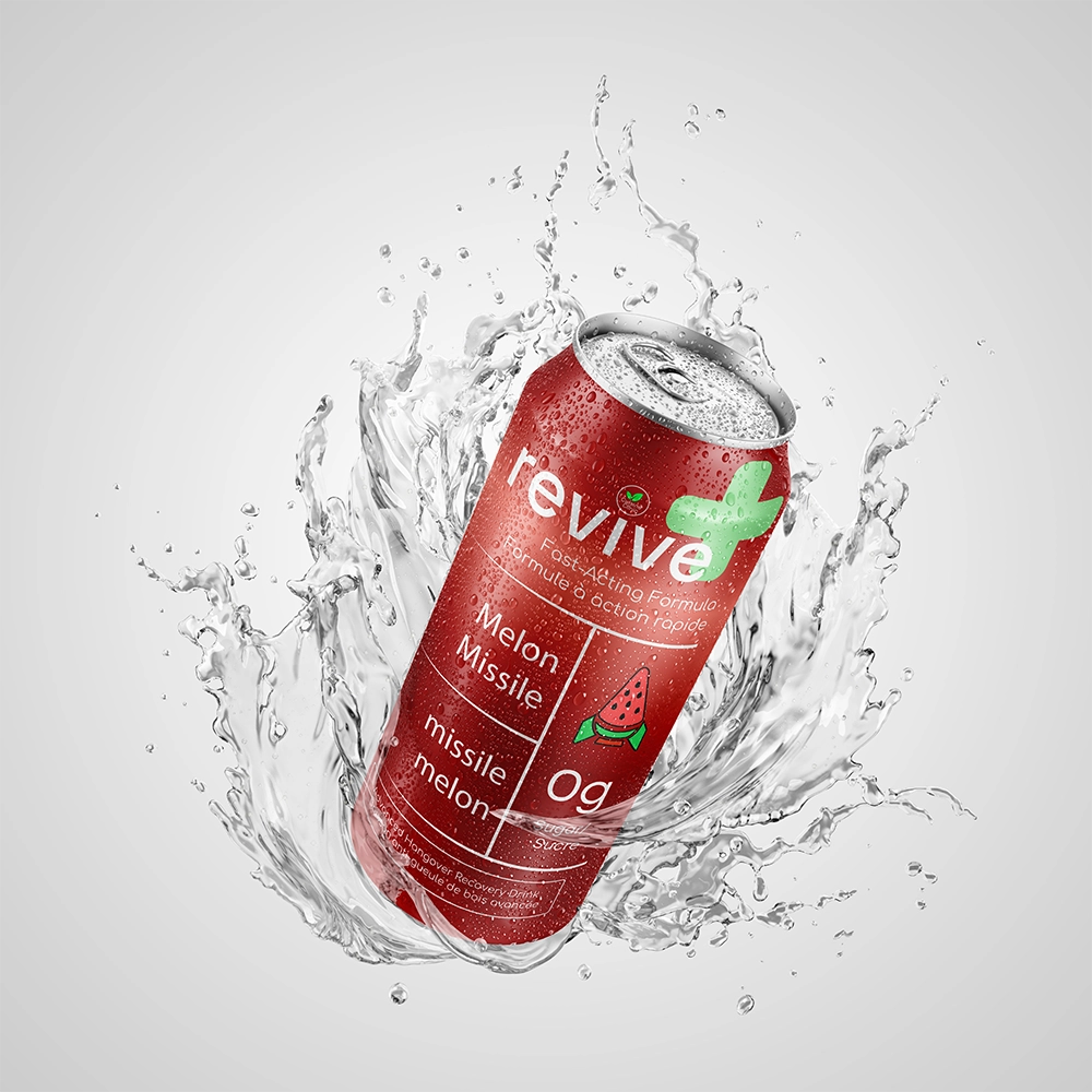
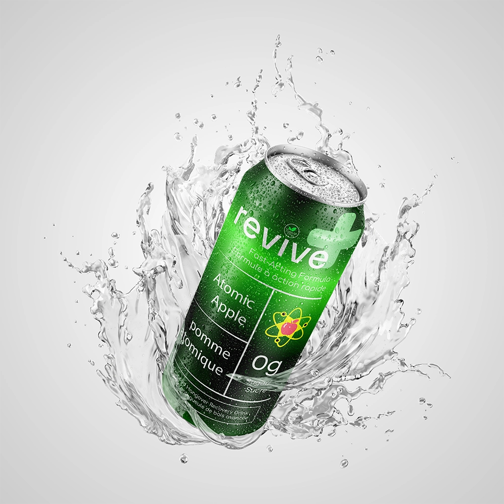
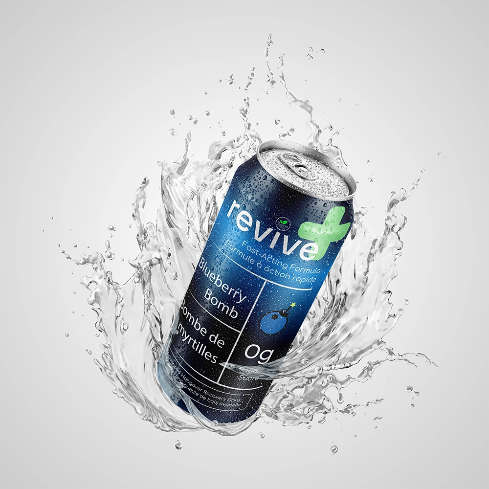
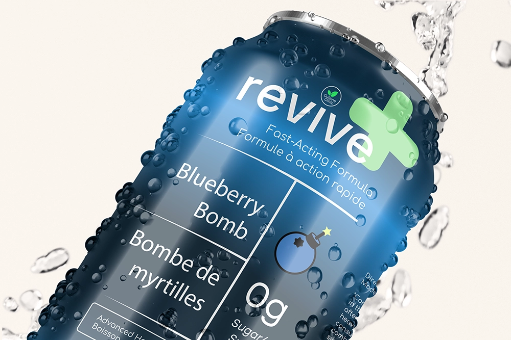
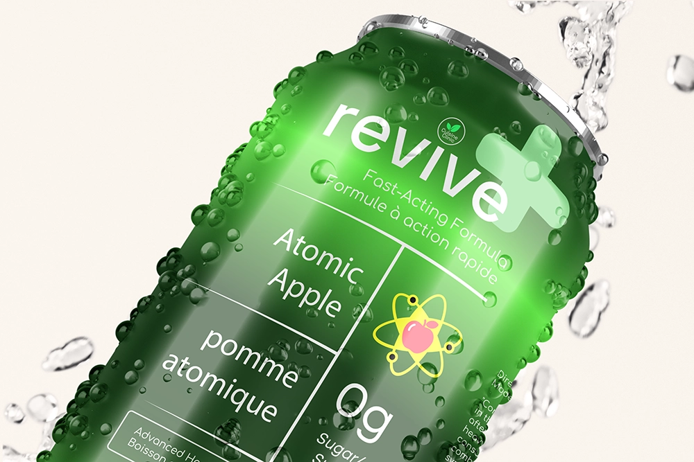
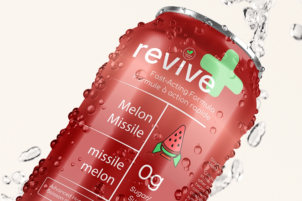
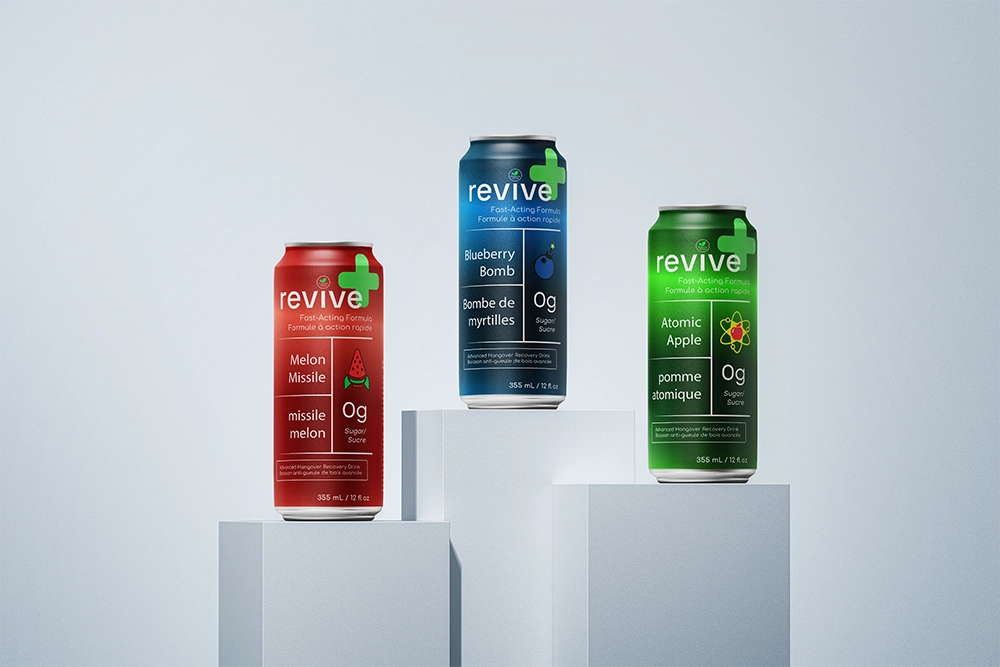
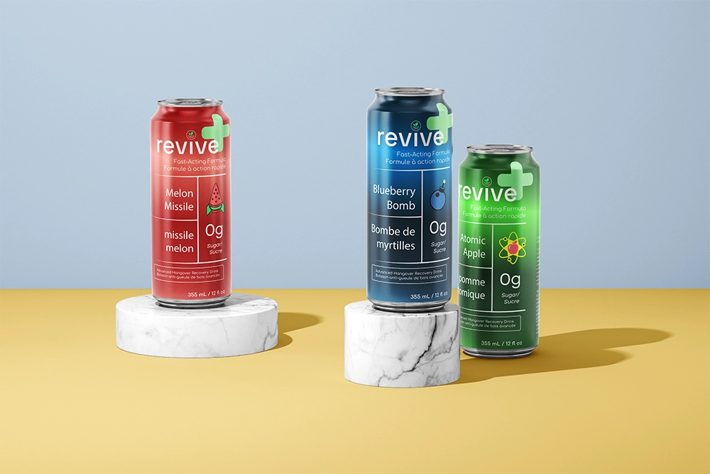
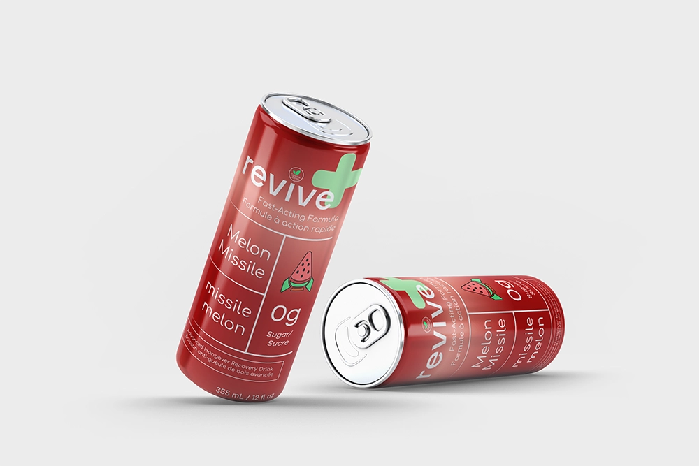
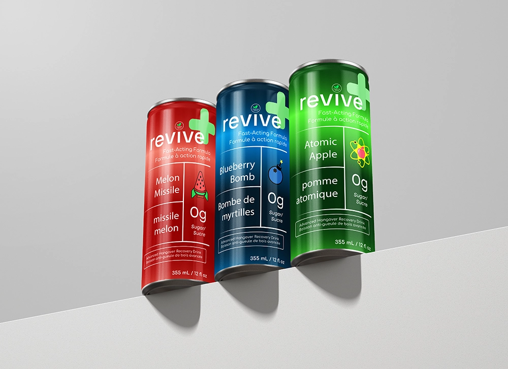
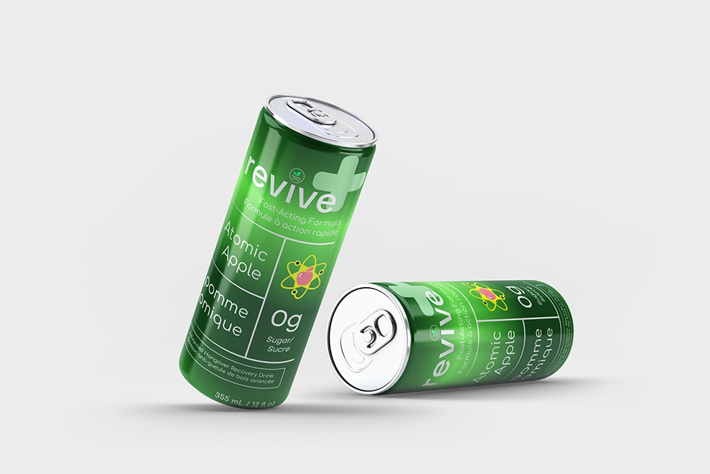
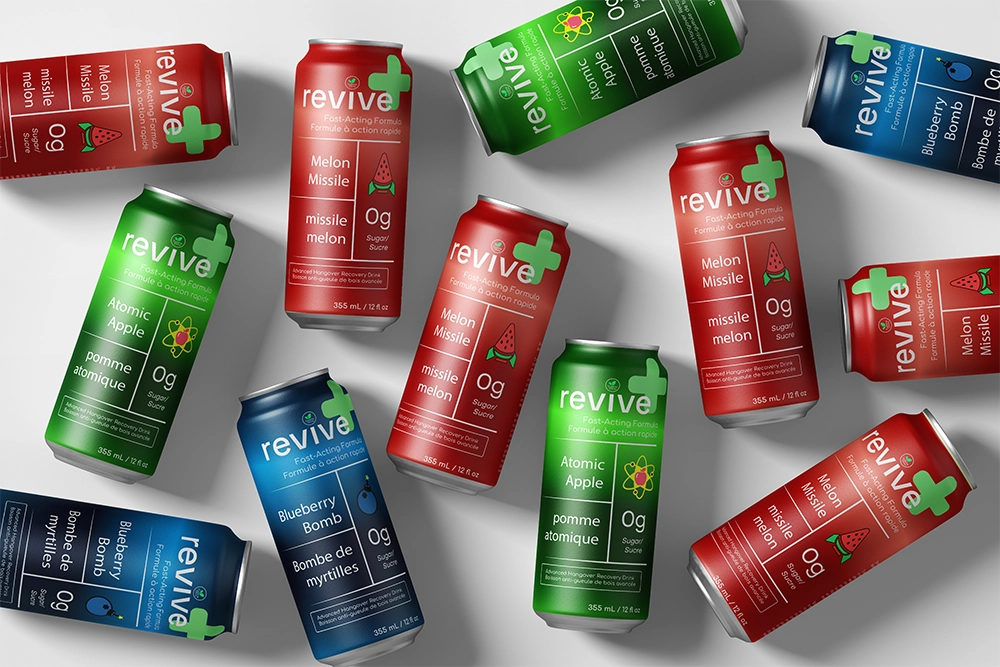
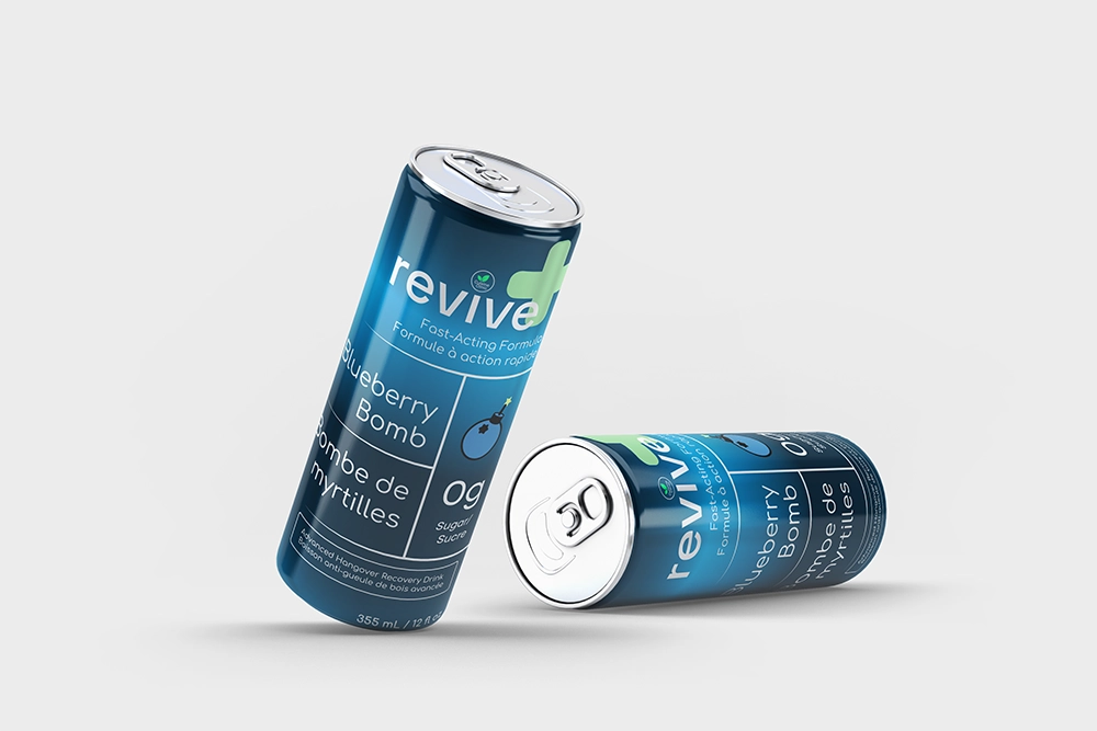
Recovery should never feel like a chore. While the market is flooded with options, most products feel like a dull pharmacy visit or an overwhelming assault of loud graphics. I recognized a clear gap for a brand that understands the need for a genuine fresh start rather than just a quick fix.

My mission was to bridge that gap by transforming the concept of a medical remedy into a premium experience. By clearing out the visual noise, I built a system that is clean, orderly, and effortless. The result is a design that provides total clarity exactly when the user needs it most.

[ Design System ]

To bridge the gap between medical science and a natural fresh start, I developed an identity built on three core symbolic elements. By grounding the brand in clinical cues, the system provides a sense of reliability and calm right when the user needs it most.

1.

Core Promise

revive
Identity:

I centered the 'revive' typography as the primary focal point of the branding.

Reason:

Clean, bold type creates a direct signal for a fresh start. It ensures the promise of returning to energy is the first thing a user sees while navigating the morning-after haze.

2.

Natural Roots

Cuisine Clinic seal
Identity:

I designed the 'Cuisine Clinic' seal as a circular mark featuring a central leaf icon.

Reason:

This secondary mark anchors the identity in nature. It balances the medical precision of the brand with a clear nod to its organic, plant-based ingredients.

3.

Clinical Trust

Identity:

I incorporated a soft green medical cross as a subtle yet consistent visual anchor.

Reason:

The cross establishes an immediate connection to professional care. It provides a sense of security and reliability exactly when the user needs clarity most.

[ Typography ]

A dual-font system balances clinical authority with approachable recovery. Sharp technical lines paired with organic curves keep the brand professional yet welcoming.

1.

Technical Authority

Aa Bb Cc Dd Ee Ff 0123456789
abcdefghijklmnopqrstuvwxyz

Space Grotesk

As primary brand typeface

Reason:

Its sharp construction provides the clinical precision the brand needs. It reinforces "complexity simplified," making the recovery process feel organized and professional.

2.

Organic Balance

Aa Bb Cc Dd Ee Ff 0123456789
abcdefghijklmnopqrstuvwxyz

Comfortaa

As secondary brand typeface

Reason:

It softens the medical aesthetic and reflects the organic nature of the ingredients, ensuring the brand doesn't feel too sterile.

[ Flavor icons ]

A set of minimalist symbols was created to provide instant visual clarity during a hazy morning, bridging the gap between technical science and natural recovery.

Blueberry Bomb

Blueberry Bomb revive can

Concentrated explosion of flavor

#2A73BC
#E4FF71

Classic bomb silhouette merged with a central blueberry.

I wanted to show an "explosion" of flavor and recovery. By keeping the icon simple, I made sure the taste is obvious and easy to recognize without adding extra clutter.

Atomic Apple

Atomic Apple revive can

Fusion of energy and science

#59F93D
#FFFF00
#FF6178

Minimalist apple centered within a scientific atomic orbital.

I used this to show the link between energy and science. I went with a bright green so the icon pops off the shelf, immediately signaling that this is the high-energy flavor.

Melon Missile

Melon Missile revive can

Direct hit of hydration

#FF5050
#3ADB67

Watermelon slice reimagined as a streamlined vertical rocket.

I designed this to show that the hydration is fast-acting. I used warmer coral tones to give it a natural, friendly feel that balances out the sharper clinical look of the brand.

[ Gallery ]

Drag to spin

[ Retrospective ]

Clarity is harder to design than complexity. Anyone can add. Knowing what to take away takes a lot more conviction.

Trust in Simplicity

Every early version had more going on. More color, more texture, more noise. At some point I stopped adding and started editing, and that's when it actually started to feel like something worth looking at. Learning to trust the empty space was harder than filling it.

Technical Bridging

There's a moment when a flat design meets a real surface and you find out if it actually holds up. Moving between Illustrator and Photoshop mockups taught me to think about the physical form from the very first line. The concept and the construction stopped being two separate things.

Visual Efficiency

Each icon had to communicate a flavor instantly, no label, no supporting text, just the shape doing all the work. I went through a lot of versions that were close but kept missing something. Eventually I realized I was overcomplicating it. The simpler I made each one, the more obvious it became which direction was right.